Squeeze
Squeeze
Open a can of Squeeze and taste the playful side of refreshment. Made with real fruit juice and just a hint of sweetness, each sip delivers pure joy—no added junk, just honest flavor. Designed to brighten your day, Squeeze is more than a drink—it’s a mood.
Research
Research
To create a fun, health-conscious soda brand appealing to Gen Z, I studied contemporary packaging trends across beverage industries with a focus on minimalism, playful illustration, and transparency in nutritional content. I analyzed how colors and characters affect emotional perception, especially for younger consumers seeking healthier, feel-good alternatives to traditional sodas.
To create a fun, health-conscious soda brand appealing to Gen Z, I studied contemporary packaging trends across beverage industries with a focus on minimalism, playful illustration, and transparency in nutritional content. I analyzed how colors and characters affect emotional perception, especially for younger consumers seeking healthier, feel-good alternatives to traditional sodas.
Research
To create a fun, health-conscious soda brand appealing to Gen Z, I studied contemporary packaging trends across beverage industries with a focus on minimalism, playful illustration, and transparency in nutritional content. I analyzed how colors and characters affect emotional perception, especially for younger consumers seeking healthier, feel-good alternatives to traditional sodas.
Design
Design
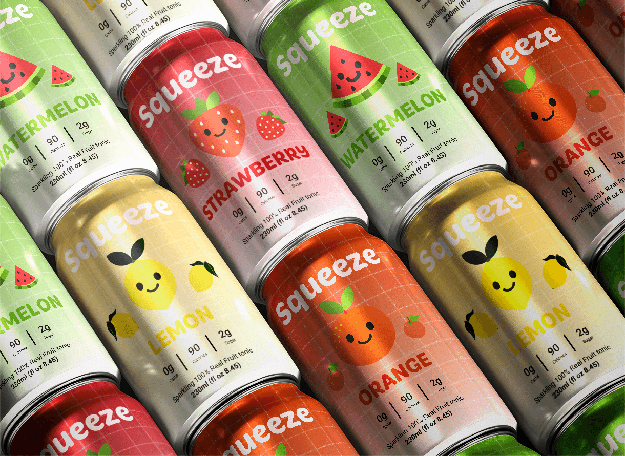
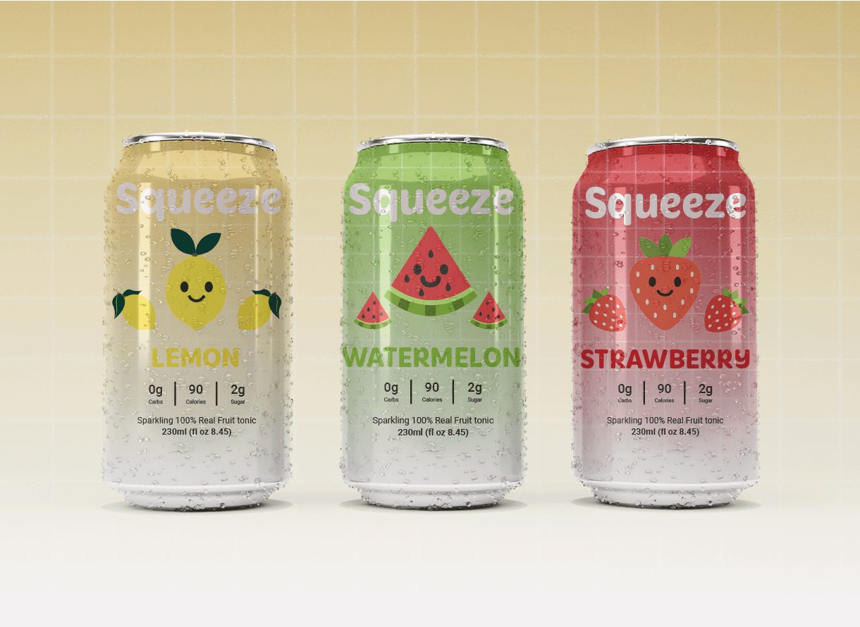
The visual identity is built on cheerful fruit characters, soft grid backgrounds, and pastel hues that signal freshness and approachability. Each flavor was assigned a distinct palette inspired by the fruit itself, enhancing shelf recognition. Typography was kept bold yet rounded to reinforce the brand’s playful and friendly tone. The grid system not only adds retro charm but also subtly nods to structure and consistency in flavor and quality.
The visual identity is built on cheerful fruit characters, soft grid backgrounds, and pastel hues that signal freshness and approachability. Each flavor was assigned a distinct palette inspired by the fruit itself, enhancing shelf recognition. Typography was kept bold yet rounded to reinforce the brand’s playful and friendly tone. The grid system not only adds retro charm but also subtly nods to structure and consistency in flavor and quality.
Design
The visual identity is built on cheerful fruit characters, soft grid backgrounds, and pastel hues that signal freshness and approachability. Each flavor was assigned a distinct palette inspired by the fruit itself, enhancing shelf recognition. Typography was kept bold yet rounded to reinforce the brand’s playful and friendly tone. The grid system not only adds retro charm but also subtly nods to structure and consistency in flavor and quality.
Development
Development
The final packaging system was designed for scalability across digital and physical platforms—from retail shelves to social media ads. Each can features clean nutritional data, a smiling fruit mascot, and a matte-to-gloss contrast for a tactile, premium feel. The back label delivers a clear message: real fruit, no junk. The product line embodies refreshment, joy, and honesty—everything Gen Z demands from their beverages today.
The final packaging system was designed for scalability across digital and physical platforms—from retail shelves to social media ads. Each can features clean nutritional data, a smiling fruit mascot, and a matte-to-gloss contrast for a tactile, premium feel. The back label delivers a clear message: real fruit, no junk. The product line embodies refreshment, joy, and honesty—everything Gen Z demands from their beverages today.
Development
The final packaging system was designed for scalability across digital and physical platforms—from retail shelves to social media ads. Each can features clean nutritional data, a smiling fruit mascot, and a matte-to-gloss contrast for a tactile, premium feel. The back label delivers a clear message: real fruit, no junk. The product line embodies refreshment, joy, and honesty—everything Gen Z demands from their beverages today.
Concept
Concept
The concept behind Squeeze was to create a sparkling fruit tonic that feels as joyful and honest as the ingredients inside. I wanted the brand to speak directly to a younger, health-conscious audience by combining nostalgic design elements—like pixel grids and smiley-faced fruits—with modern minimalism. Each flavor is personified with a friendly fruit character to build emotional connection and shelf appeal. The result is a playful yet clean visual identity that stands out in a saturated beverage market while communicating transparency, freshness, and fun.
The concept behind Squeeze was to create a sparkling fruit tonic that feels as joyful and honest as the ingredients inside. I wanted the brand to speak directly to a younger, health-conscious audience by combining nostalgic design elements—like pixel grids and smiley-faced fruits—with modern minimalism. Each flavor is personified with a friendly fruit character to build emotional connection and shelf appeal. The result is a playful yet clean visual identity that stands out in a saturated beverage market while communicating transparency, freshness, and fun.
Concept
The concept behind Squeeze was to create a sparkling fruit tonic that feels as joyful and honest as the ingredients inside. I wanted the brand to speak directly to a younger, health-conscious audience by combining nostalgic design elements—like pixel grids and smiley-faced fruits—with modern minimalism. Each flavor is personified with a friendly fruit character to build emotional connection and shelf appeal. The result is a playful yet clean visual identity that stands out in a saturated beverage market while communicating transparency, freshness, and fun.


More Works More Works
More Works More Works
©2025 MAYA KSIBI DESIGN
GO BACK TO TOP
©2025 MAYA KSIBI DESIGN
GO BACK TO TOP