Mr Leo's Bakehouse
Mr Leo's Bakehouse
Open the doors to Mr. Leo’s Bakehouse, where every detail—from the almond-topped croissants to the charming storefront—invites you into a world of warmth and tradition. Established in 1952, this rebrand blends vintage familiarity with modern simplicity to create a welcoming identity that feels both timeless and fresh.

Research
Research
To build a brand rooted in authenticity, I explored traditional European bakehouse aesthetics, analyzed contemporary bakery design trends, and studied local competitors. Insights from vintage signage, handwritten menus, and neighborhood bakeries informed the visual and emotional tone.
To build a brand rooted in authenticity, I explored traditional European bakehouse aesthetics, analyzed contemporary bakery design trends, and studied local competitors. Insights from vintage signage, handwritten menus, and neighborhood bakeries informed the visual and emotional tone.
Research
To build a brand rooted in authenticity, I explored traditional European bakehouse aesthetics, analyzed contemporary bakery design trends, and studied local competitors. Insights from vintage signage, handwritten menus, and neighborhood bakeries informed the visual and emotional tone.
Design
Design
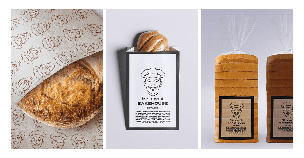
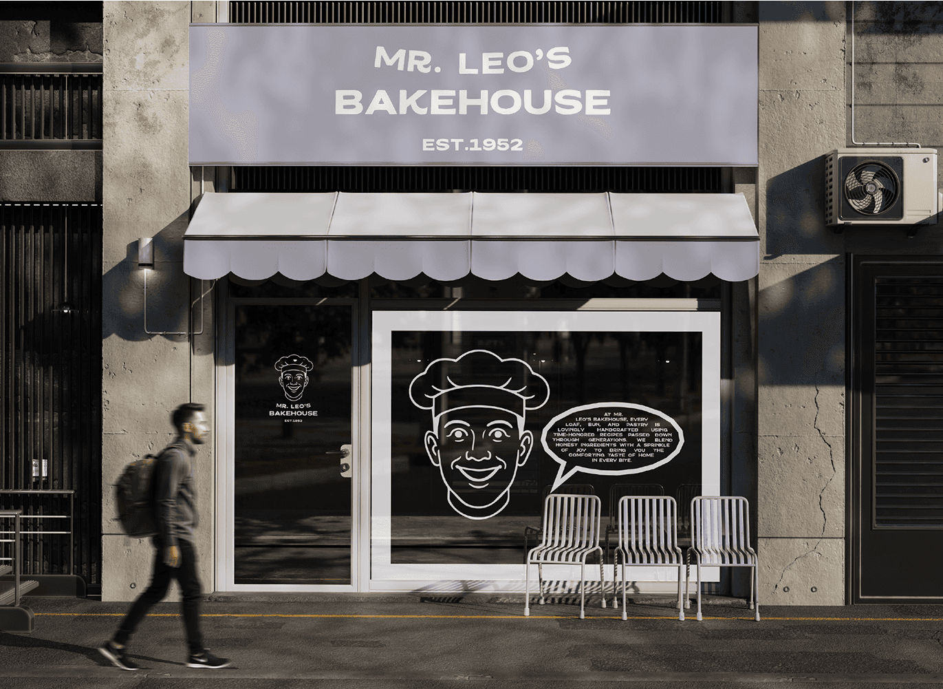
The branding centers on a retro-inspired line illustration of Mr. Leo—a smiling baker in a chef’s hat—paired with bold, friendly typography. The color palette, anchored by a soft purple (#adadc2), evokes calm and cleanliness, while contrasting with the warm hues of golden breads and pastries.
The branding centers on a retro-inspired line illustration of Mr. Leo—a smiling baker in a chef’s hat—paired with bold, friendly typography. The color palette, anchored by a soft purple (#adadc2), evokes calm and cleanliness, while contrasting with the warm hues of golden breads and pastries.
Design
The branding centers on a retro-inspired line illustration of Mr. Leo—a smiling baker in a chef’s hat—paired with bold, friendly typography. The color palette, anchored by a soft purple (#adadc2), evokes calm and cleanliness, while contrasting with the warm hues of golden breads and pastries.
Development
Development
I created a cohesive visual system adaptable to signage, packaging, uniforms, and interior design. Assets included logo variations, parchment patterning, window vinyls, shelf styling, and custom product tags—ensuring the brand feels consistent in every touchpoint.
I created a cohesive visual system adaptable to signage, packaging, uniforms, and interior design. Assets included logo variations, parchment patterning, window vinyls, shelf styling, and custom product tags—ensuring the brand feels consistent in every touchpoint.
Development
I created a cohesive visual system adaptable to signage, packaging, uniforms, and interior design. Assets included logo variations, parchment patterning, window vinyls, shelf styling, and custom product tags—ensuring the brand feels consistent in every touchpoint.
Concept
Concept
Mr. Leo’s Bakehouse is about more than bread. It’s about trust, routine, and small delights baked daily. The branding honors its legacy while connecting with a new generation of locals looking for quality, charm, and a familiar face behind the counter.
Mr. Leo’s Bakehouse is about more than bread. It’s about trust, routine, and small delights baked daily. The branding honors its legacy while connecting with a new generation of locals looking for quality, charm, and a familiar face behind the counter.
Concept
Mr. Leo’s Bakehouse is about more than bread. It’s about trust, routine, and small delights baked daily. The branding honors its legacy while connecting with a new generation of locals looking for quality, charm, and a familiar face behind the counter.

More Works More Works
More Works More Works

©2025 MAYA KSIBI DESIGN
GO BACK TO TOP
©2025 MAYA KSIBI DESIGN
GO BACK TO TOP