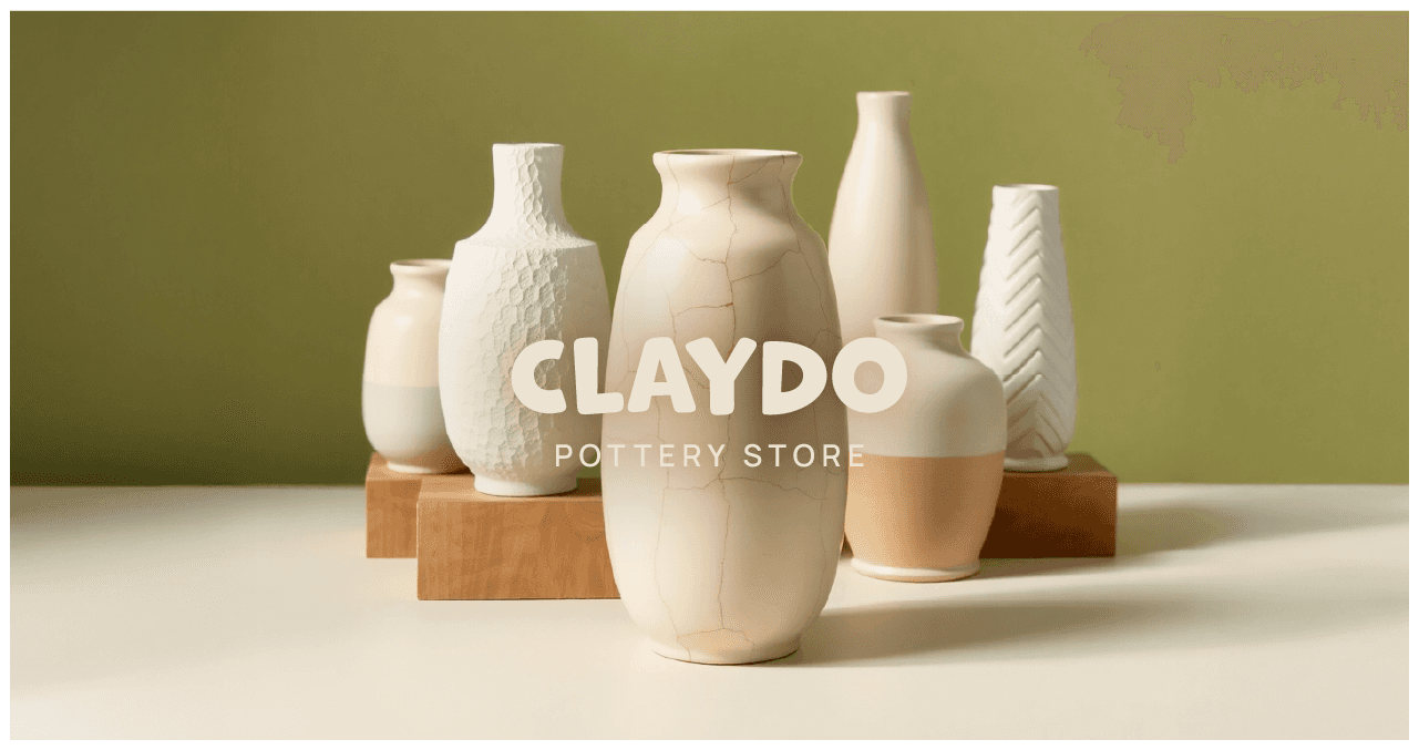
CLAYDO
CLAYDO
Hand-formed, sun-dried, and made to be loved — CLAYDO celebrates the beauty of earthy imperfection. Whether you're a maker or just a lover of things that feel made with heart (and hands), this brand is your daily dose of tactile joy.
Research
Research
We got our hands dirty — literally.
To build a brand rooted in authenticity, we studied local ceramic studios, interviewed makers, and dove deep into material culture. We mapped out how pottery connects with slow living, artistry, and self-expression. The result? A strategy that speaks to creators, collectors, and clay-curious customers alike.
Research
We got our hands dirty — literally.
To build a brand rooted in authenticity, we studied local ceramic studios, interviewed makers, and dove deep into material culture. We mapped out how pottery connects with slow living, artistry, and self-expression. The result? A strategy that speaks to creators, collectors, and clay-curious customers alike.
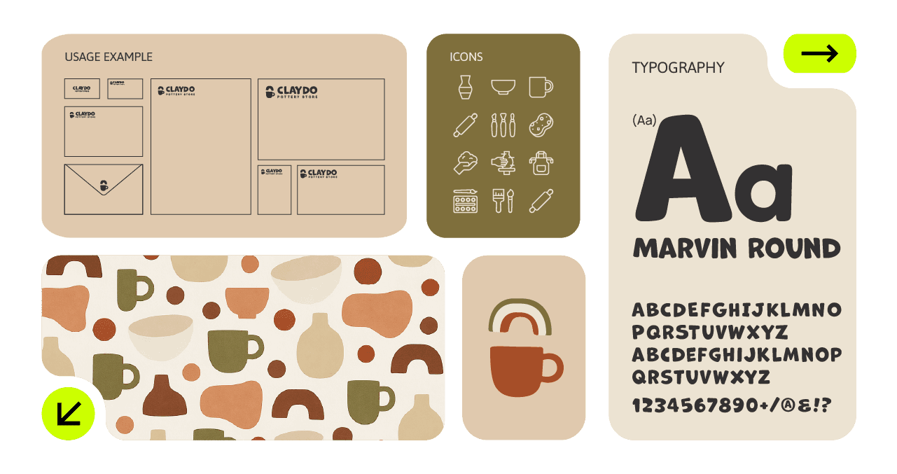
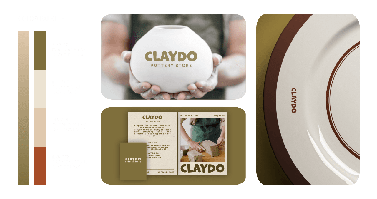
Design
Design
Soft shapes. Confident lines. Organic feels.
CLAYDO’s visual identity blends tactile warmth with bold clarity. The logo — set in Marvin Round — was tweaked to echo the curves and squish of hand-thrown pottery. A grounded color palette (think: kiln-baked red, unglazed beige, olive green) evokes natural materials while remaining modern and versatile.
Design
Soft shapes. Confident lines. Organic feels.
CLAYDO’s visual identity blends tactile warmth with bold clarity. The logo — set in Marvin Round — was tweaked to echo the curves and squish of hand-thrown pottery. A grounded color palette (think: kiln-baked red, unglazed beige, olive green) evokes natural materials while remaining modern and versatile.
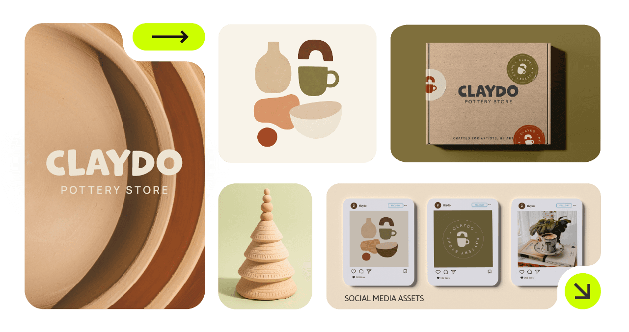
Development
Development
Built to hold shape — across every surface.
From packaging to plates, social templates to store signage, we crafted a complete brand world. Patterns inspired by vessel silhouettes and ceramic forms were developed for web, print, and merch. Every asset is scalable, usable, and designed to grow with the brand.
Development
Built to hold shape — across every surface.
From packaging to plates, social templates to store signage, we crafted a complete brand world. Patterns inspired by vessel silhouettes and ceramic forms were developed for web, print, and merch. Every asset is scalable, usable, and designed to grow with the brand.
Concept
Concept
Crafted for artists. Designed for warmth.
CLAYDO’s concept centers on celebrating the maker’s process — from pinch to polish. It’s not about perfection. It’s about personality. The brand is welcoming, nostalgic, and tactile — a love letter to the joy of creating with your hands.
Crafted for artists. Designed for warmth.
CLAYDO’s concept centers on celebrating the maker’s process — from pinch to polish. It’s not about perfection. It’s about personality. The brand is welcoming, nostalgic, and tactile — a love letter to the joy of creating with your hands.
Concept
Crafted for artists. Designed for warmth.
CLAYDO’s concept centers on celebrating the maker’s process — from pinch to polish. It’s not about perfection. It’s about personality. The brand is welcoming, nostalgic, and tactile — a love letter to the joy of creating with your hands.
More Works More Works
More Works More Works

©2025 MAYA KSIBI DESIGN
GO BACK TO TOP
©2025 MAYA KSIBI DESIGN
GO BACK TO TOP